By Linda Armstrong Exhibitors Magazine
f you want to look your best, these are the most 10 graphic mistakes you have to avoid. Typical show visitor is a reluctant and cautious creature with a busy schedule. He seldom approaches an unfamiliar exhibitor directly and asks, “So who are you guys and what do you do?” Instead, he hangs back, studies the booth, and reads the back wall to learn why he should spend one more minute at your exhibit. In most small exhibits, the graphics are the exhibit. They provide attendees with their first clues as to why a company is exhibiting and what it has to offer. They are the first customer connection. The graphical story — the words and pictures on the exhibit — is the de facto substitute for a conversation with a staff person. Helpful graphics convey the company’s message quickly and clearly, making visitors open to dialogue with the staff. Even exhibitors who’ve heard it all before still get it wrong. That’s because understanding what’s right is only half the trick; the other half is understanding what’s wrong. Before you can create the coup de grace of graphics, you need a firm handle on what not to do — so you can avoid it. After you sidestep the potholes, you’ve got a much greater chance of getting it right. Here are 10 things not to do with back wall graphics. Learn from these graphic mistakes, and avoid them like socks with sandals.
GRAPHIC MISTAKE 1: TOO MANY WORDS
RULE:
Graphics paraphrase. Conversations explain. “If your text takes more than three seconds to read, it’s too much,” says Chuck Michel, executive vice president of Group 360 Communications, a St. Louis graphics firm. That means you can use roughly six words and maybe your company name or logo — unless it’s something dreadfully long like West Texas Trucks, Tires, Guns, Ammo, Dentures, and Banjos Inc.
GRAPHIC MISTAKE 2: THE WRONG WORDS
RULE:
Benefits attract buyers. “Attendees only want to know what’s in it for them,” says Susan Shuttleworth, trade-show manager at Dallas-based TransCore. “For example, tell attendees your product ‘Cuts transportation costs by 20 percent!’ or that it can ‘Double your ROI.’” Tell attendees how your product or service will help them, rather than about all the awards you’ve won. For example, if your graphic claims that your widgets are “Safe and Reliable for Industrial Use”, you’re talking benefits — and attendees are listening.
GRAPHIC MISTAKE 3: TYPE THAT'S TOO SMALL
RULE:
Text should be a minimum of 4-inches tall. Make your type 1-inch high for every 3 feet you step back, Michel says. If you want attendees to read your copy from 20 feet away, you need letters at least 6.5-inches tall. Since most attendees pass your exhibit at a minimum of 12 feet from your back wall, text should be at least 4 inches tall.
GRAPHIC MISTAKE 4: ARTSY FONTS
RULE:
Use serif or sans serif styles only, two fonts per graphic. Out of three primary letter styles — serif, sans serif, and decorative — sans serif and serif styles work best. Numerous studies show these options are easy to distinguish and read. However, you can judge for yourself. Also, remember not to use more than two different fonts per graphic.
GRAPHIC MISTAKE 5: CONFLICTING BACKGROUNDS
RULE:
Light over dark or dark over light. Safe color combinations typically include dark colors (e.g. black, navy blue, forest green) on light backgrounds (e.g. white, lemon yellow, light blue) as well as light colors on dark backgrounds. Michel warns against using red on blue, or black on any dark color.
GRAPHIC MISTAKE 6: TEXT BELOW SIGHT LINERULE:
Text goes in the two-foot zone. The two-foot zone across the top of the back wall is the ideal location for text, says Adam Brodsley, principal of Volume Inc., a San Francisco design firm. “It’s really the only area people continuously see in an aisle full of people.” If you can’t put all of the text that high, at least stay at eye level, which is 5-feet high and up.
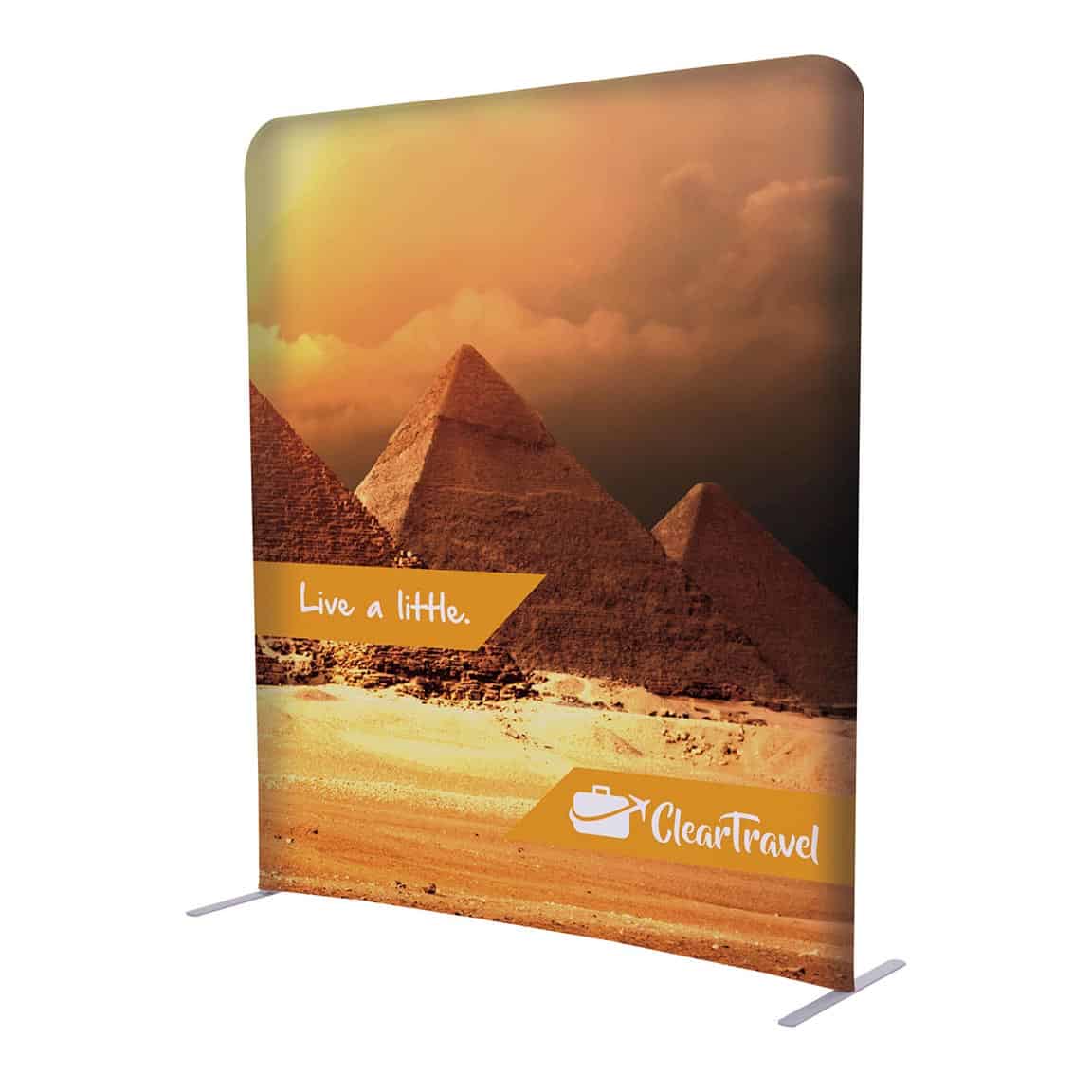
GRAPHIC MISTAKE 7: TOO MANY IMAGES
RULE:
Use one image only, visible at 30 feet. “You want one main image people can see from 30 feet away,” says Geoffrey Kilmer, president of Photoworks Creative Group in Charlottesville, VA. More than that is visual clutter. What kind of image? One that grabs people’s attention and communicates the brand or product in a glance. The image should make them stop and read the text — rather than explaining 15 bullet points about why the 450 super mixer whips the competition.
GRAPHIC MISTAKE 8: POOR IMAGE QUALITY
RULE: Use only high-resolution images. “Garbage in. Garbage out,” Michel says. “Never use a low-quality image, i.e., one with a resolution too low for your graphic size.” Michel offers these broad guidelines: • If you’re using stock images, provide them as 4-by-5-inch transparencies or larger. • Avoid anything that is below 4,000 pixels in actual scan size. • Inexpensive, royalty-free images aren’t meant for big graphics. Spend the money early on or regret it later. To avoid graphics garbage, your best bet is to consult a professional graphic designer before making a choice.
GRAPHIC MISTAKE 9: POOR LIGHTING
RULE: Place lights every 2 to 3 feet. For an even wash, space 100- or 200-watt halogen lights every 2 to 3 feet, suggests Paul Fine, president of Fine Design Associates Inc. in Doylestown, PA. For optimum coverage, position them 2 feet out from the back wall. Unless you want a theatrical effect, use down lighting rather than up lighting. Also be sure to light the entire exhibit, not just the header, Michel warns (see photo at right). Focus the lights further down to even the wash.
GRAPHIC MISTAKE 10: NICKS AND DINGS
RULE: Neatness counts. Accidents and hungover forklift drivers happen. But most graphics damage can be avoided with careful handling and cleaning. Our experts suggest the following care and maintenance techniques. • Laminate it. To avoid damages, laminate your graphic, unless you’re only going to use it once. Hire a professional laminator. Delamination is a common problem with graphics, since they experience extreme temperature fluctuations — from more than 100 degrees inside tractor-trailers to freezing temperatures in airplane bellies. Professional laminators understand the expansion and contraction rates of different materials. • Get a helper. Graphics are often damaged when one person tries to un-pack, hang, and repack them alone. • Pack properly. Don’t just roll up your graphics and toss them in a case. Place a sheet of plastic or brown, butcher-style paper between the panels to prevent scratches. • Clean it. You can wipe down most graphics with Windex and a paper towel. Just don’t get the liquid near the edge of the graphic, or it may seep under the laminate and cause a bubble. Most black marks and general goopy stuff can be removed with a cotton ball and Goof Off, a multi-purpose cleaner. And don’t forget the magnets, which lose their powers of attraction when they get dirty. Rubbing alcohol usually does the trick.
0 comments